
Home Depot’s Hubspace, In-App Feedback
Role: Product Manager and UX Designer
Duration: 6 months
Skills: Product Requirements, User-Stories, UX Research and Ideation, Wireframing, UI and Icon Design
Project Objectives
At Afero, our team was responsible for developing and maintaining the Hubspace smart home app for The Home Depot. As part of ongoing efforts to improve the user experience, we were asked to design and build a built-in feedback system that would make it easier for users to share their experiences directly within the app. The feature needed to help users report bugs, suggest new features, and share general feedback in just a few clicks — ultimately improving product quality and reducing negative app store reviews.
Although this project was smaller in scope compared to others I’ve worked on at Afero, I chose to include it because it highlights my range as both a Product Manager and UX designer. It’s also one of the few examples of my work that isn’t protected by an NDA.
Development Process
An outline of my journey while working on this feature…
1) Research & Competitive Analysis
2) Construction of Feature Requirements
3)
Design Sprint
4) Feature Ideation
5) Final
Implementation
6) Impact & Reflections
I started by conducting a competitive analysis to understand how other leading smart home and IoT apps handle in-app feedback collection. I focused on platforms like Google Home, Amazon Alexa, and Kasa to identify common design patterns and opportunities for improvement within Hubspace.
Phase 1) Research & Competitive Analysis

Google Home

Kasa

Amazon Alexa
Research Synthesis… what did I learn?
– All three apps store feedback options within easily accessible areas, typically linked to account settings.
– Users across platforms are provided with options to opt in and provide additional information alongside their feedback.
– The use of clear and guiding language in the user interface.
Shared Trends
– While Google Home and Alexa have a multi-step process involving menus like "Help & Feedback," Kasa streamlines the experience with a direct "Feedback" tab on the "About" page.
– Each app collects different types of data from users; for instance, Google and Alexa emphasize diagnostic information, while Kasa provides a more open-ended, user-driven feedback process.
Differences
Informed Recommendations… what approach should we take?
On one end, a minimalist approach like Kasa’s would offer a straightforward submission process for open-ended feedback. On the other end, a more comprehensive system like Alexa’s would involve incorporating numerous issue categorizations, detailed disclaimers, and options for providing diagnostic information.

My conclusion? Hubspace’s UX should fall somewhere in the middle!
Phase 2) Construction of Feature Requirements
Next, I used insights from the competitive analysis to create a detailed Product Requirements Document for Hubspace’s in-app feedback feature. The PRD outlined everything from backend requirements and user stories to initial UI considerations. My approach consistently centers on real user interactions with their products, so including these user stories was key to ensuring the feature aligned with both technical goals and user needs.
“As a user, I should be able to easily classify or categorize my feedback, so that Afero can more clearly understand my issue.”
“As a user, the UI to submit my feedback must be simple, clean, and easy to use, so that I don’t become more frustrated in the process of submitting my input.”
Some of the Development Feature Requirements…
Users must be able to submit feedback on all Hubspace products & features.
Users must be able to easily classify their feedback.
UI to submit feedback must be simple & easy to use.
Users may be able to opt-in to share additional user data associated with their Hubspace account.
Solution must balance how much data we legally can collect from users v. how much data we need in order for their feedback to be effective.
Phase 3) Design Sprint
With approval from Product and Engineering on the initial PRD, I moved on to refining the UX requirements and beginning the design process. Insights from my competitive analysis pointed toward a simple, intuitive UI. I started by sketching a basic user flow (shown below), which quickly evolved into low-fidelity hand-drawn wireframes as the first draft of the interface.

User Flow Sketch
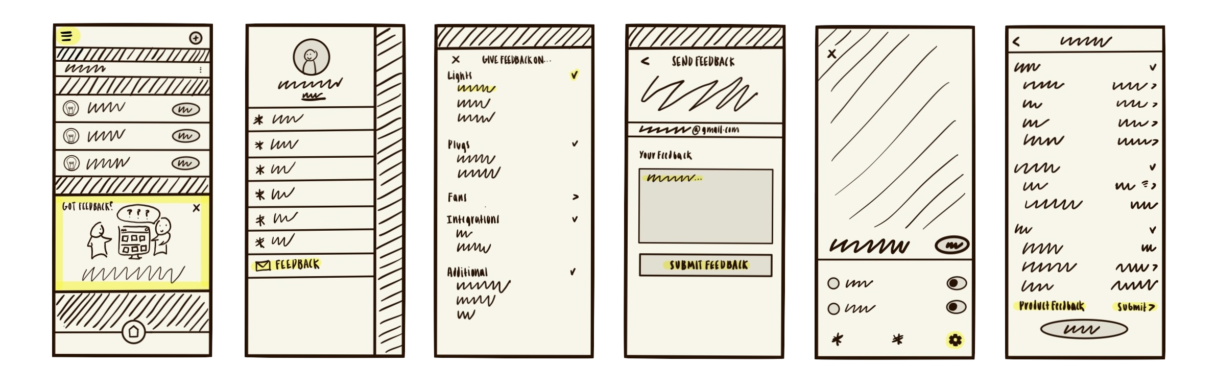
Low-Fidelity Wireframes
After securing approval from the rest of my product management team, I proceeded to Photoshop a first draft of the in-app feedback wireframes. Feel free to scroll through!
Wireframes (Version 1.0)


Phase 4) Iteration
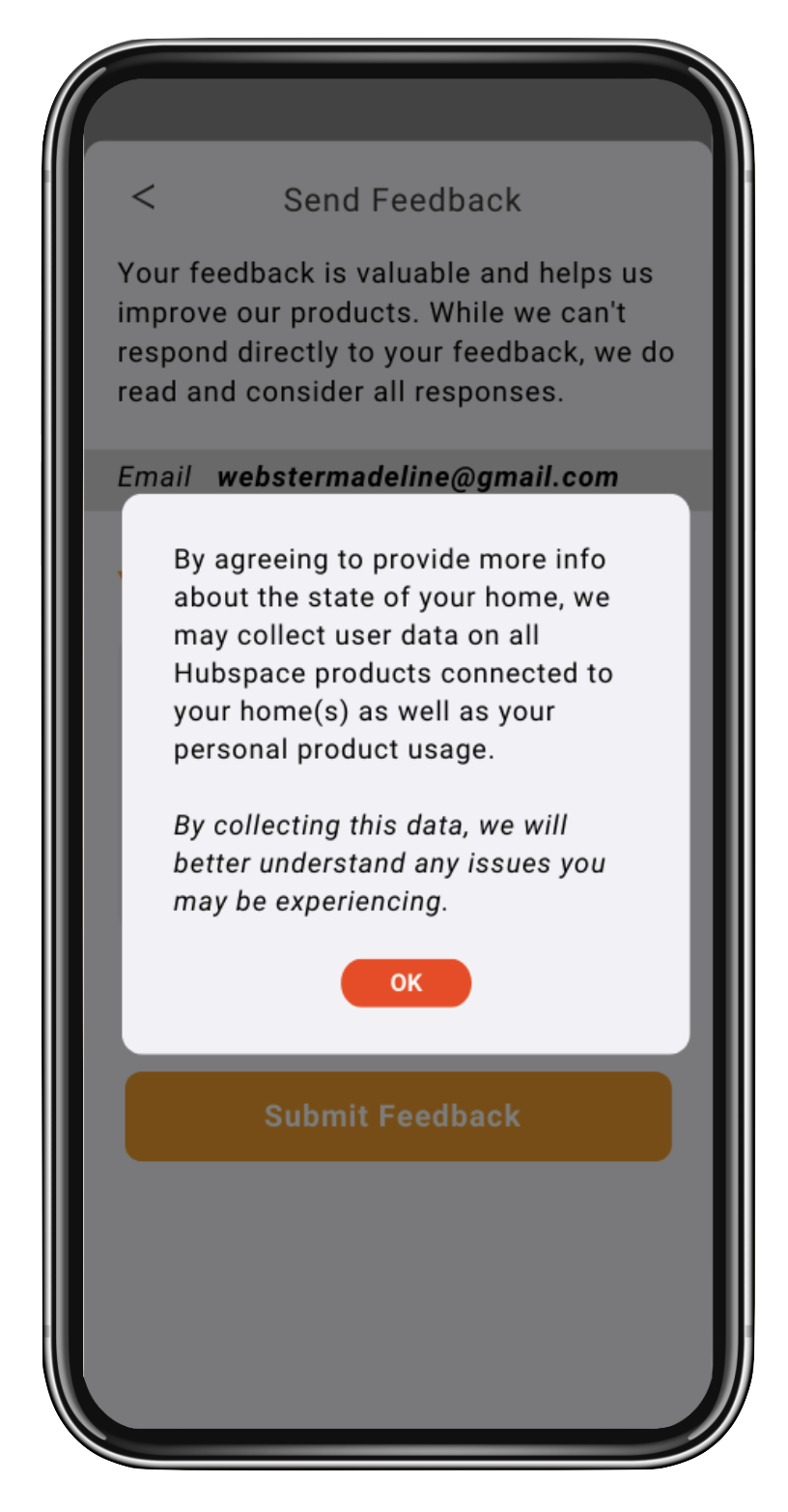
After several rounds of iteration and feedback, I developed a refined second version of the wireframes and presented them with my manager to the head of the Hubspace division at The Home Depot. The discussion focused primarily on how user data would be collected and managed, and following that presentation, Home Depot approved the feature for full development.
Once we received their approval, our team began implementing Hubspace’s in-app feedback feature. Although this phase was expected to move quickly, competing priorities across other Home Depot initiatives extended the development timeline. With limited engineering resources, I collaborated closely with the mobile app team to streamline the feature for launch — maintaining core functionality while simplifying the overall user experience.
Summary of Changes Made
Simplified the overall UI for a faster, cleaner interaction flow
Removed the product/feature selection step and optional additional info fields
Adjusted legal and support language to align with Home Depot’s requirements
Updated confirmation screen icons and removed unnecessary pop-ups to reduce friction
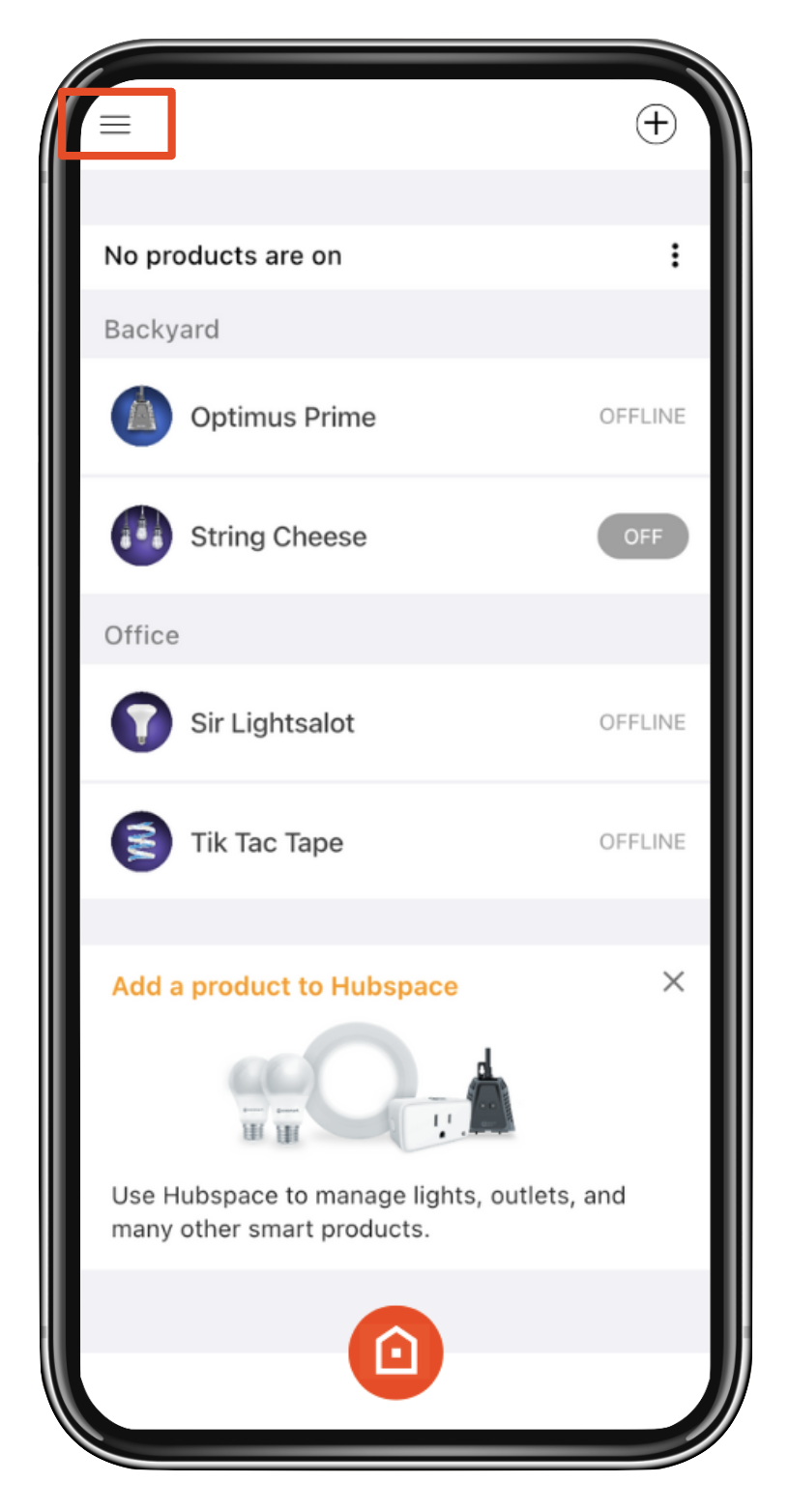
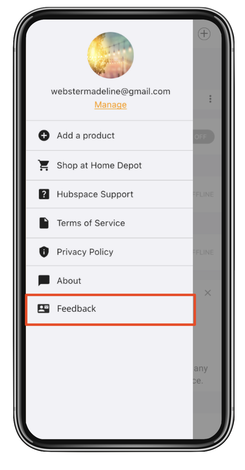
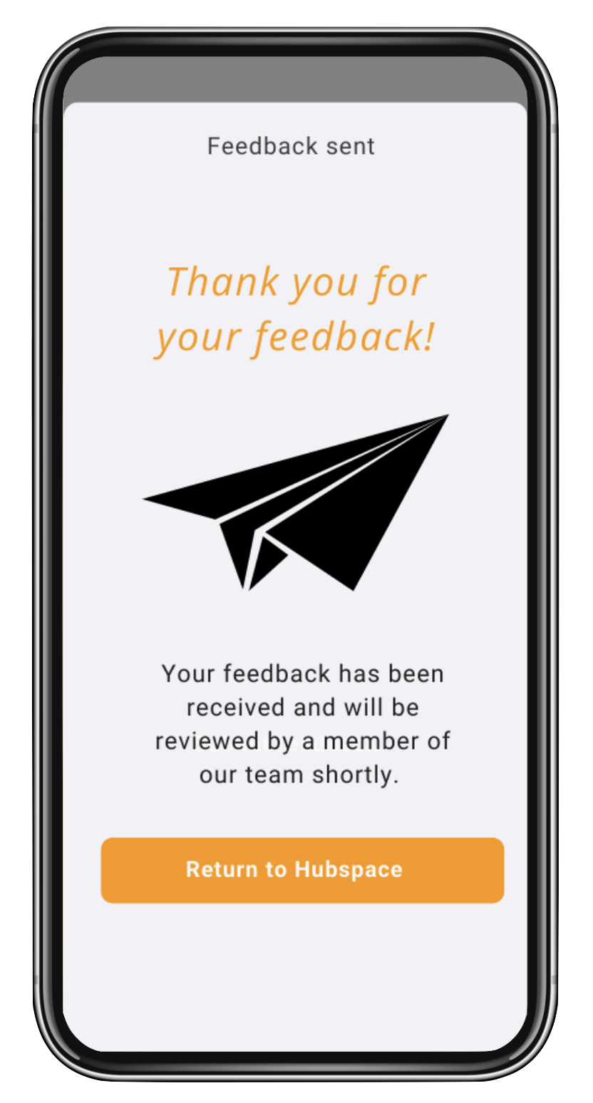
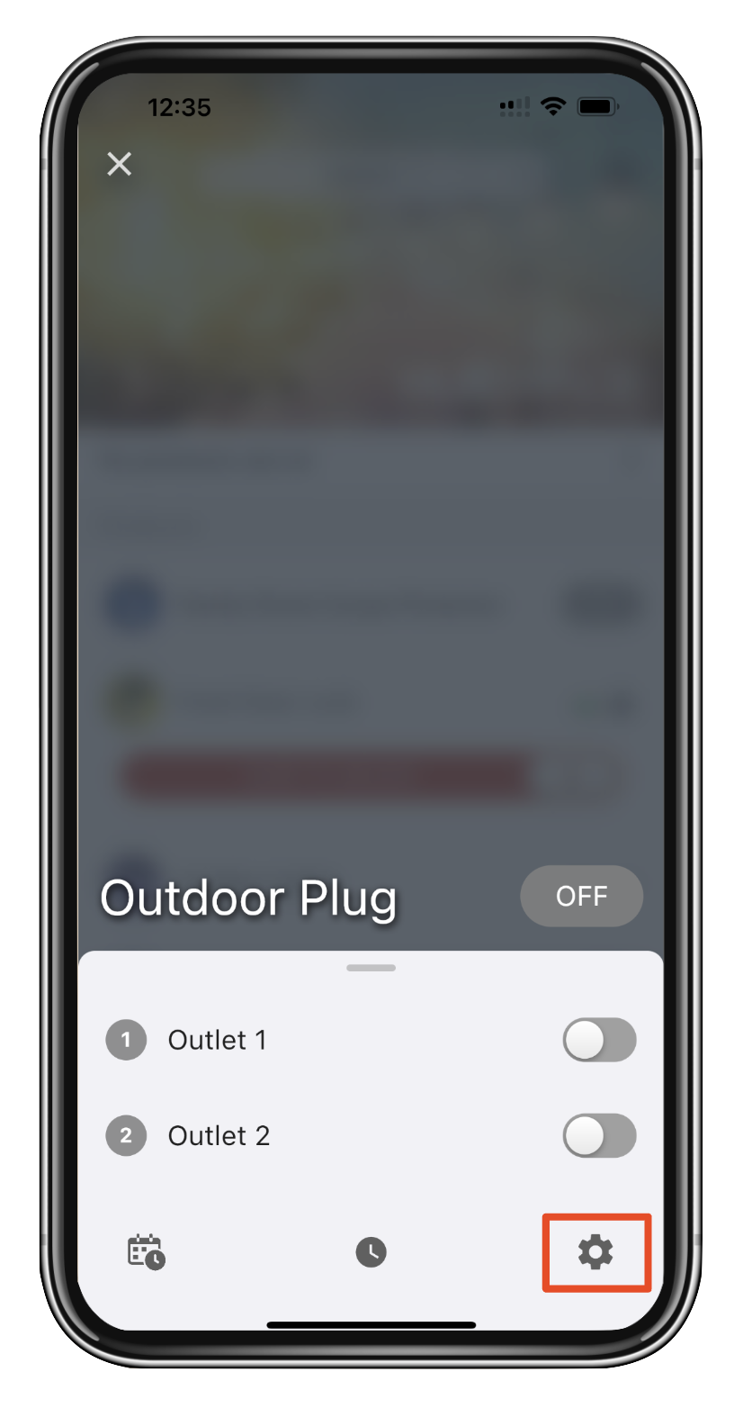
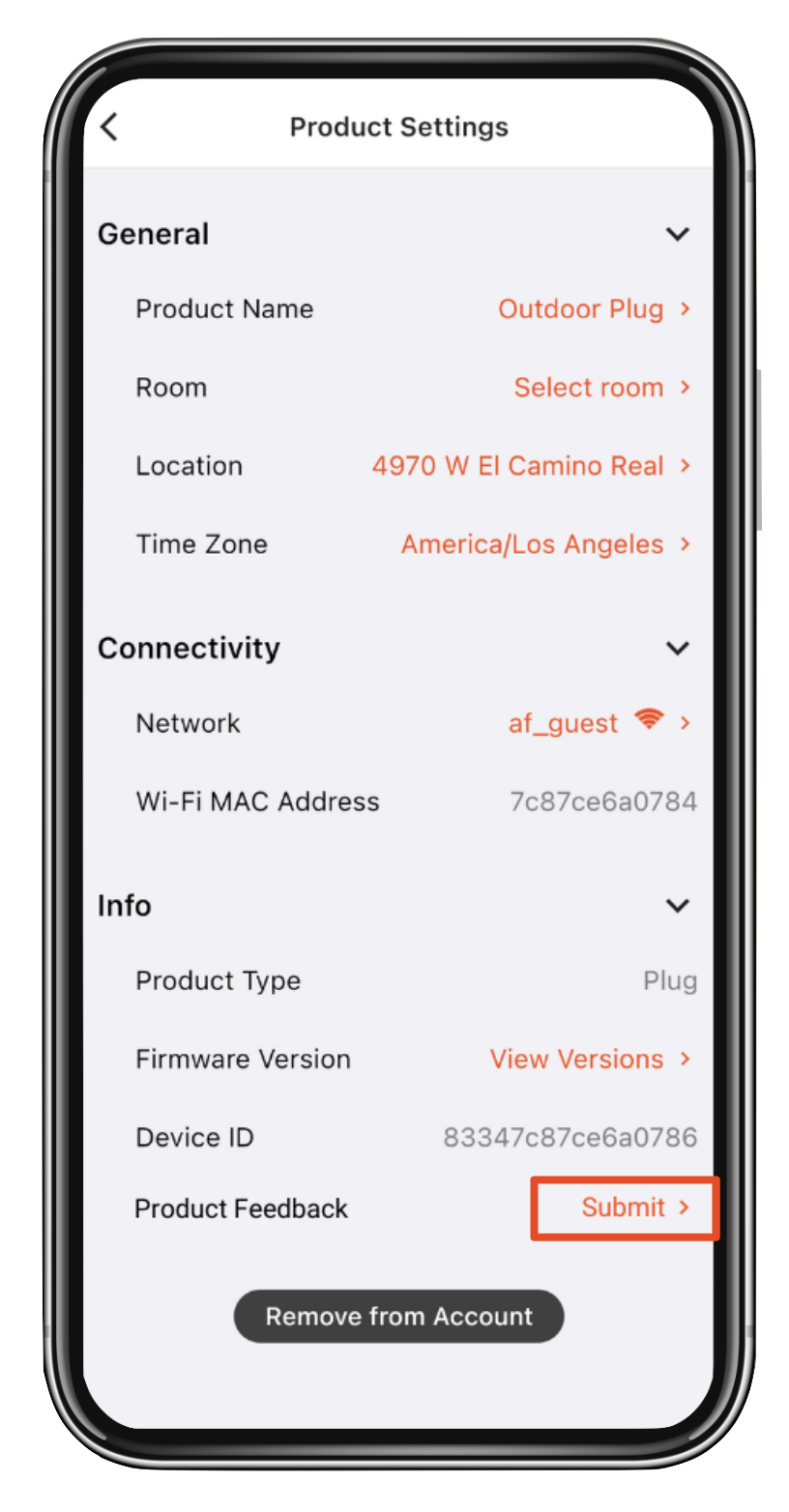
The screenshots below show the final in-app implementation of the feedback feature, which launched to Hubspace users in February 2023.
Phase 5) Final Implementation

Wireframes (Final Version)
Phase 6) Impact & Reflections
After launch, the in-app feedback feature quickly gained traction — generating over 1,200 submissions within its first two months. However, the influx of responses overwhelmed Afero’s support team. Many users also used the feature to submit general support questions rather than product feedback.
1200+ feedback submissions
in two just months…
Despite efforts to adjust the workflow, the volume proved unsustainable, and Home Depot ultimately paused the feature to reassess internal support capacity. Even so, the launch was considered a success, demonstrating strong user engagement and providing valuable data to guide future iterations. For one of my first projects as a lead Product Manager and UX Designer, I was genuinely proud of the outcome.